With Minutecharts you can create wonderful charts from your data in a few minutes.
Data in, chart out.
Here's how it works:
Import your dataset
Import your dataset in CSV format or enter your data manually.
Edit your chart
Select the chart type, layout and relevant data. Adjust colors and give your chart a name.
Export your chart
Tap on export and you will find your chart in your photo gallery.
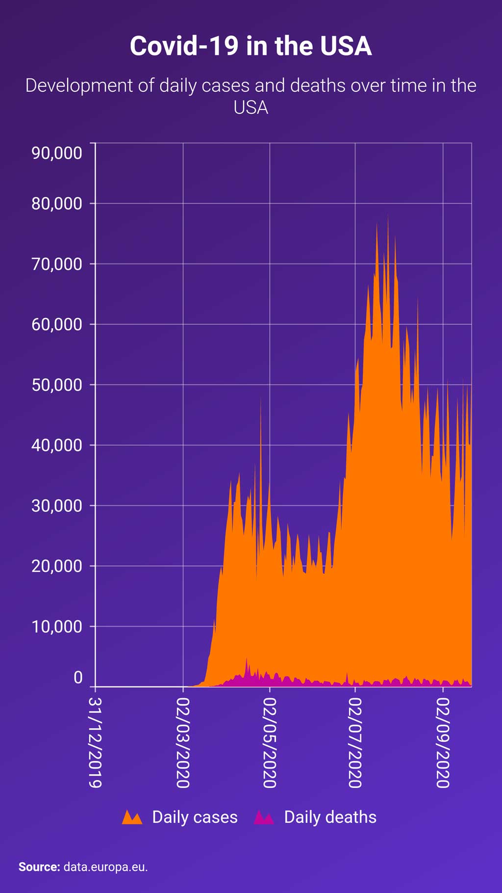
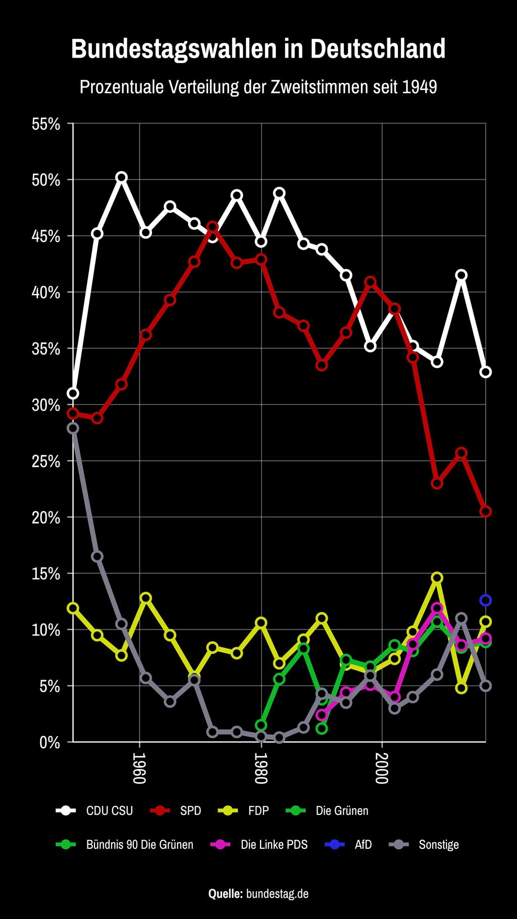

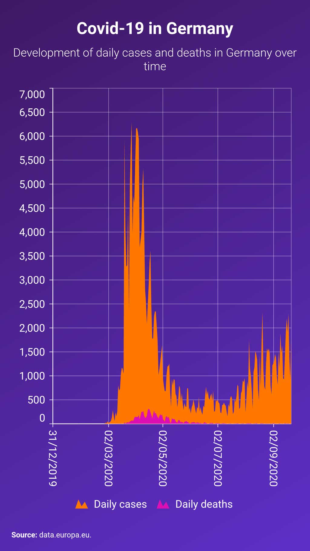



Select the right chart type
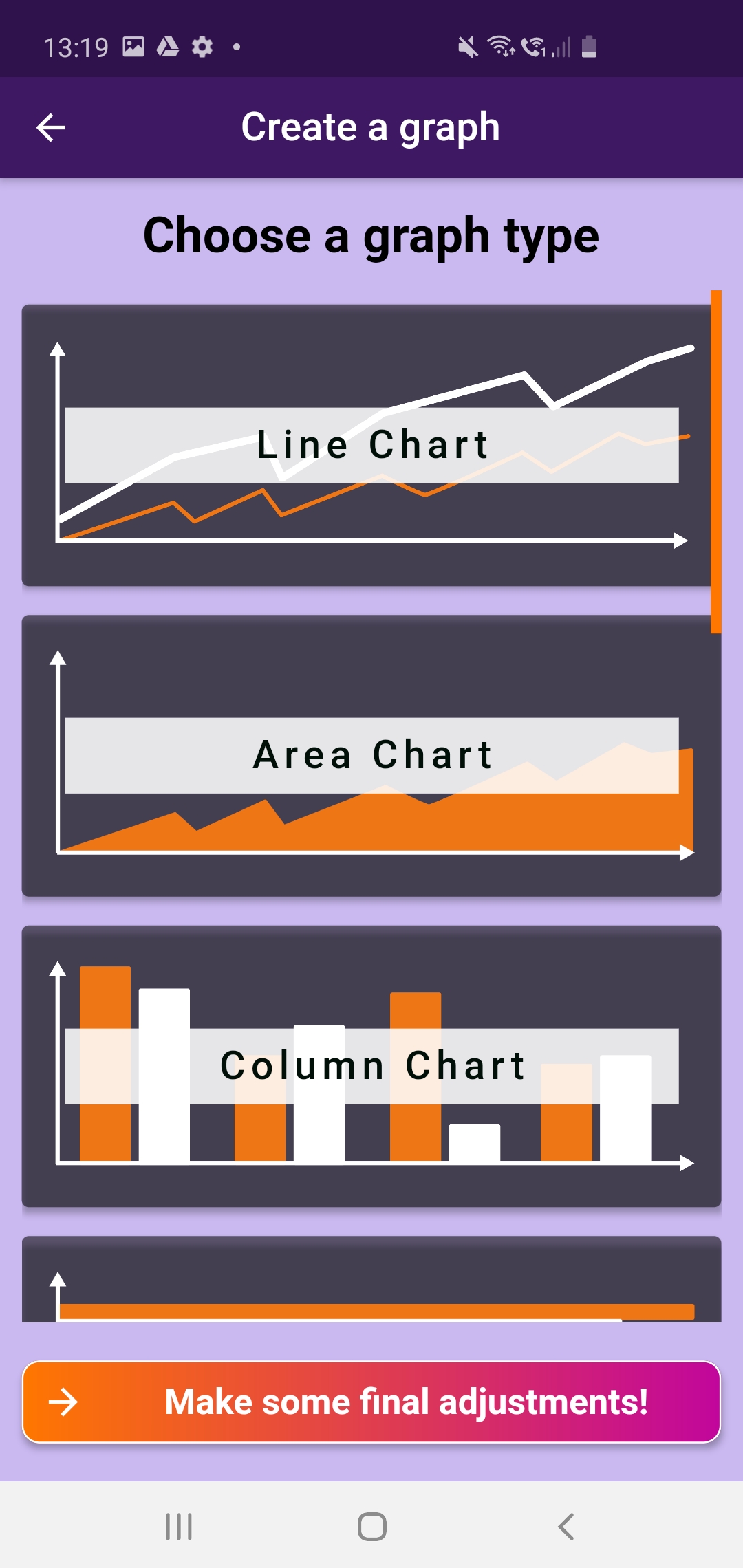
Choose from more than 10 chart types or combine several types in one graph.
- Line charts
- Area chart
- Column chart
- Bar chart
- Scatter diagram
- Stacked area chart
- Stacked column chart
- Stacked bar chart
- Pie chart
- Donut chart
- Treemap (planned)
- Bubble chart (planned)
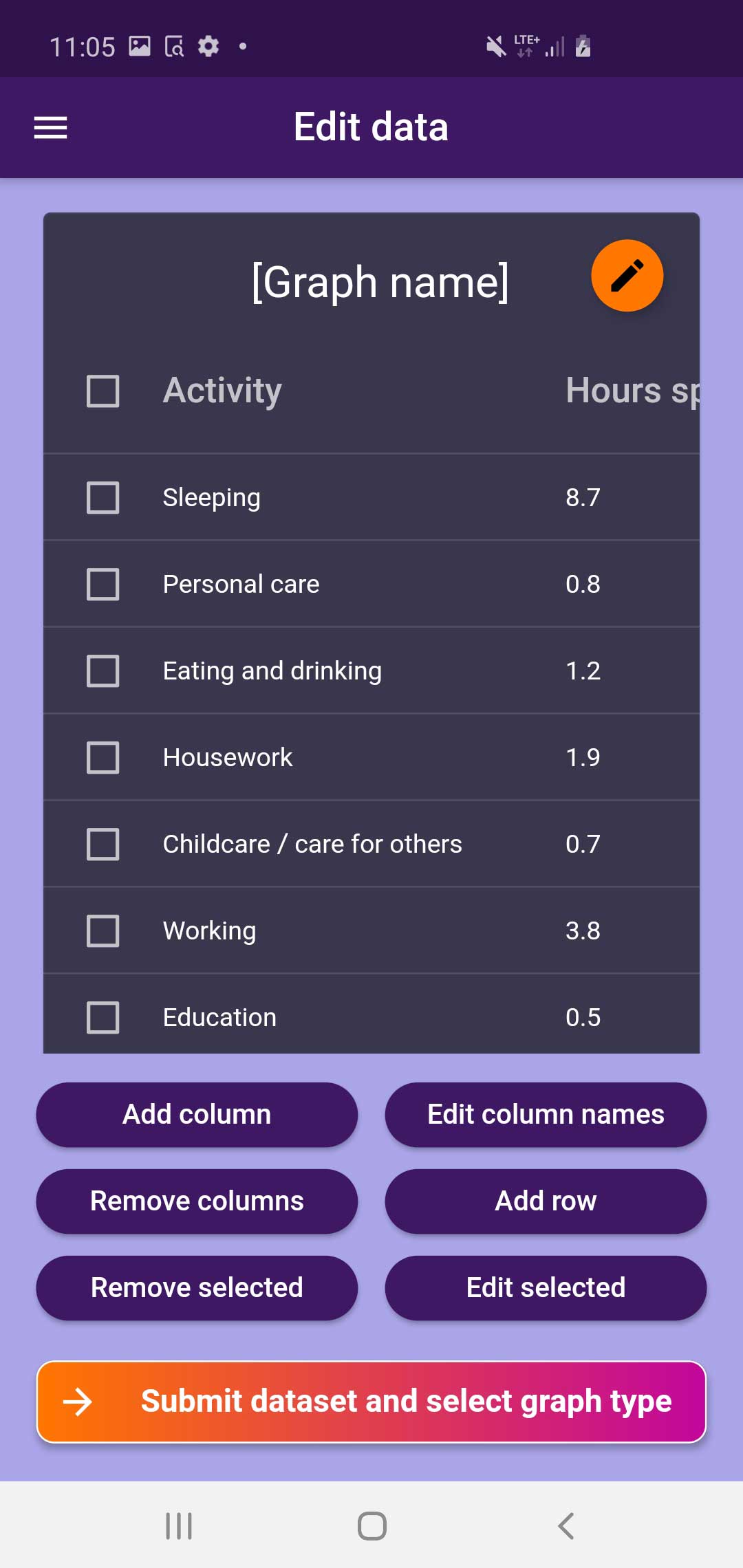
Edit datasets
Edit your record at any time. Add new rows (columns) or edit existing ones. You can also remove entries.
Create individual designs
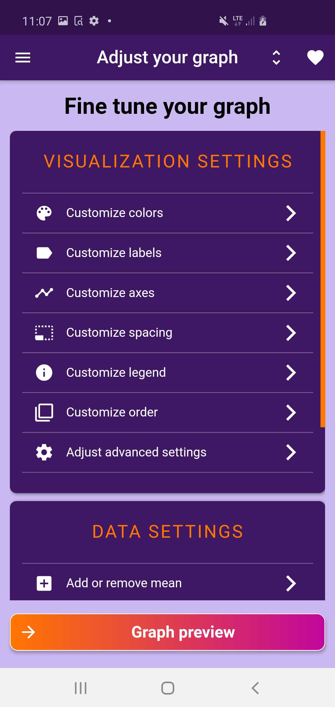
Change the layout of your diagram as you like. And add additional information if needed. Among other things you can make the following adjustments:
- Change all colors and gradients
- Add individual components (e.g. logo, data source or subtitle)
- Adjust the padding and position within the chart
- Define what is displayed and what is not (e.g. labels and axes)
- Format your labels and axis entries appropriately
- Add additional information such as the mean value or median of a data series
You can save all formatting settings as favorites.
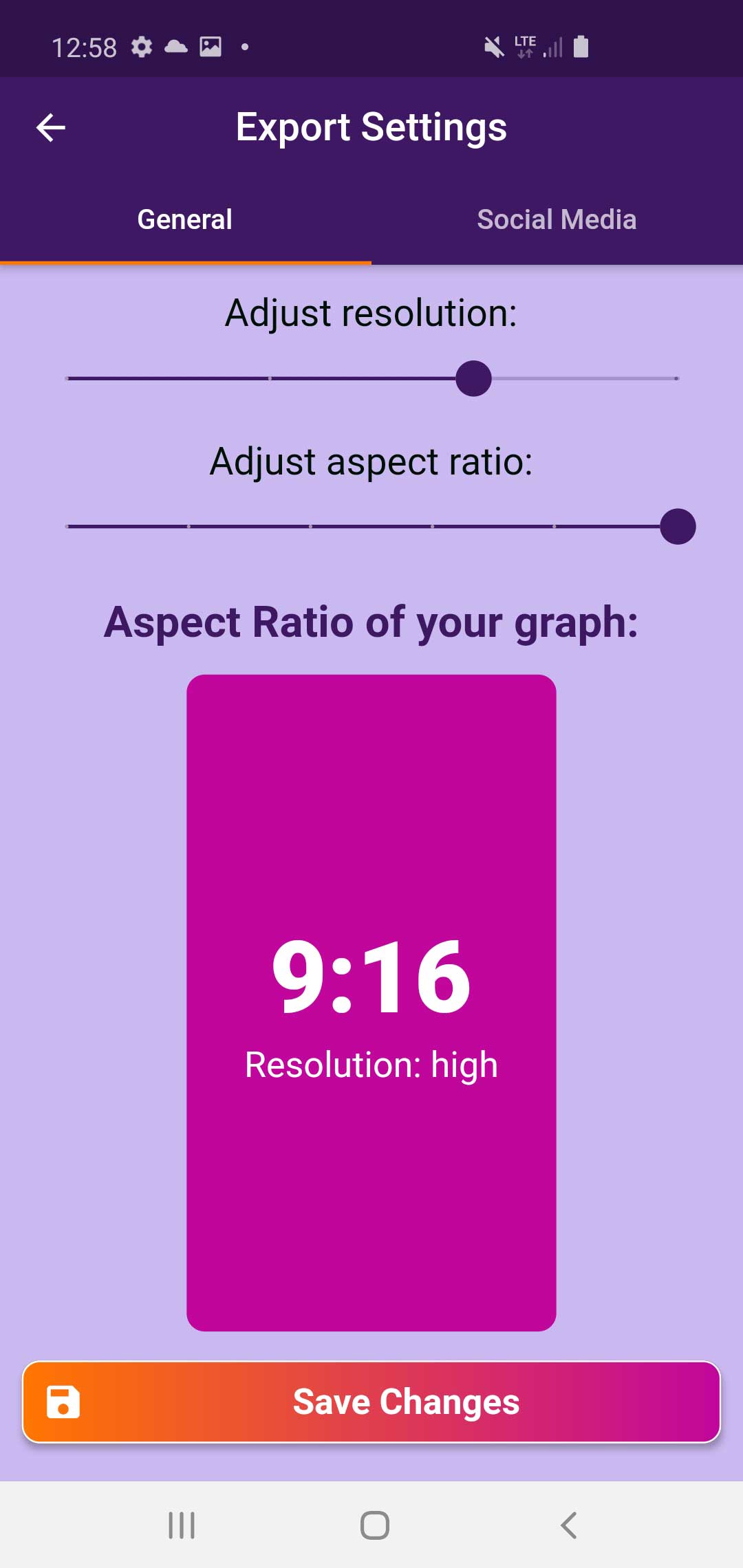
Define format and resolution
Export your charts as images in the perfect format (1.91:1 to 9:16) and resolution. Additionally, we offer optimized exports for various social media platforms:
- Instagram (1080 x 566 to 1080 x 1920)
- Quora (600 x 355 to 600 x 600)
- Snapchat (1080 x 1920)
- Twitter (1024 x 512)
- Facebook (planned)
- Pinterest (planned)
Export with one tap
Check the preview of your chart before exporting. Then you can either export or make a few more adjustments.


